Is bad design killing your conversion rate? A button that blends in or is too small on mobile could be costing you revenue every day. Discover how “small” UX Design details make a huge difference in sales and how Saikō optimizes them for success.
Imagine this scenario: A customer is in your physical store. They are holding your product. They have their wallet out. They walk to the checkout counter and… there is no cashier. They look around, get frustrated, put the product back on the shelf, and leave.
Sounds unlikely? In the digital world, this happens every single second.
At Saikō, when we analyze why digital storefronts, e-shops, or large-scale custom web applications and platforms aren’t converting, it’s rarely the core product or the pricing structure that’s to blame. Usually, it’s an “insignificant” design detail. A button that accidentally blends into the background, an input field that’s hard to tap, or a technical message that confuses the user.
These Micro-UX mistakes are the silent killers of digital conversions. Let’s look at the 3 most common ones you need to fix immediately.
1. The “Chameleon” Button (Lack of Contrast)
The ongoing design trend of hyper-minimalism has quietly hurt online sales. We frequently see “Buy Now” buttons that are rendered in dark grey on a slightly lighter grey background, or hollow “ghost buttons” (simple outlines) that completely disappear over busy product photos.
The Saikō Rule: The specific button you want the user to click (the Call to Action) must be the most visually distinct element on the entire page. If your target audience has to squint to find it, you’ve already lost them. Overcoming these basic interface pitfalls requires the meticulous attention to detail found in professional tailor-made software development.
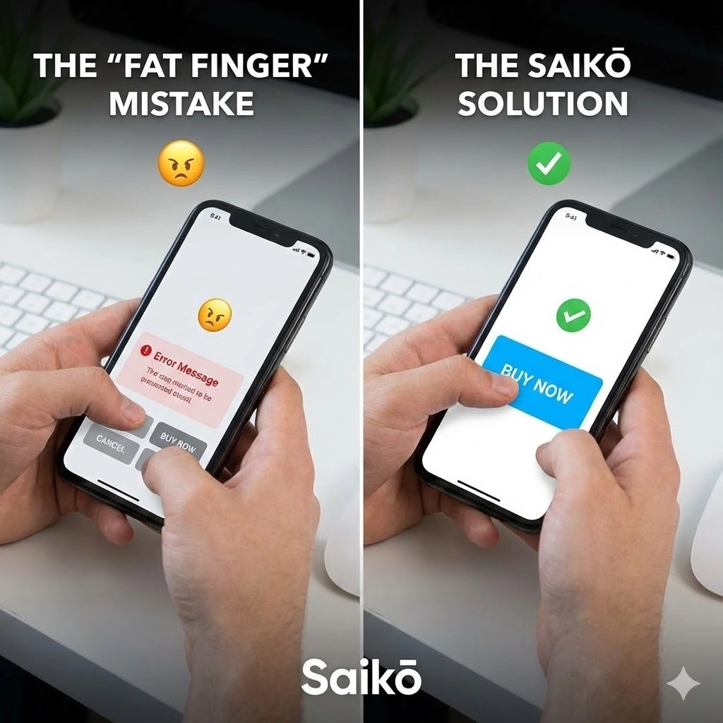
2. The “Fat Finger” Syndrome (Mobile Spacing)
Have you ever tried to tap a “Next” button on your smartphone screen and accidentally hit “Cancel” because the two choices were completely glued next to each other? This design flaw triggers what we call “Rage Clicks.” The user gets so profoundly annoyed that they close your browser tab entirely.
When optimizing responsive websites or standalone mobile and desktop apps, tap targets need adequate breathing room. Buttons must be physically large enough to be pressed effortlessly with a thumb while on the move, without requiring surgical precision.
3. The “Did I Click It?” Anxiety (System Feedback)
The user clicks “Complete Order.” The screen stays frozen. No loading spinner appears. The button doesn’t change color or display a checkmark. What is the user thinking in that exact moment? “The page froze. Will I get charged twice if I tap it again?” Fear and uncertainty instantly make them abandon the transaction.
Your software architecture must always provide immediate visual feedback for every single user action within milliseconds. Ensuring your frontend interacts seamlessly with backend systems through robust intelligent automation and API integration prevents lag, keeping the data pathway clear and predictable.
Detail is an Investment
Good digital design isn’t just about making an app or website look pretty. It’s about eliminating cognitive friction—never forcing the end-user to think.
To take this a step further, modern e-commerce enterprises deploy sophisticated AI and machine learning solutions to dynamically track these micro-interactions, identifying exactly where users hesitate or experience friction in real-time.
At Saikō, we don’t just sketch beautiful mockups. We engineer obstacle-free paths. Because we know that sometimes, the difference between a record-breaking sale and a lost customer is just a matter of 5 pixels.